What makes a good logo? |
|
When it comes to seeing a logo that makes you wonder, “Why didn’t I think of that?”, what is it about the design that gives that impression? Most graphic designers agree there are five important design elements when it comes to brand identities. Iconic (brilliantly memorable) logos are:
|
Points one and two go hand-in-hand, because if you can’t describe what a logo looks like then how will you be able to remember it? Point number three is important because colour is secondary to the shape and form. Always leave colour to the end of the design process, because if the logo doesn’t work in black only, no amount of colour will rescue it. Point number four is vital for other places the logo could be used, such as office stationery (pens, pin badges etc.) — all those little things that can easily be overlooked. Lastly, the design must be relevant for the organisation it identifies. This is accomplished through indepth research into the area of life involved, and helps to make your logo different from closely associated competitors. |
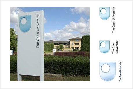
This logo illustrates the five points: |
 |
| The above logo is for Open University (OU), “the UK’s leading distance-learning organisation.” |
 |
| There are a number of text layout variations, which gives greater freedom for those reproducing the logo in different formats. For example, the top right mark (above) wouldn’t fit on the side of a pen as well as the centre right version (above). |
What I enjoy most about this design is the simplicity (the ‘O’ inside the ‘U’). The OU logo has evolved over the years, and didn’t always have the ‘glass’ effect—a common trend amongst today’s logos. It’s important to remember, however, that trends don’t last, and by designing using the latest fad, your logo will become dated, fast. Take a look at how the OU logo appeared in the past (below). |
 |
